Level 8
@jeffreyway I have encountered an issue: there should be a button to upload an image in the conversation.
1 like
Summer Sale! All accounts are 50% off this week.
@jeffreyway I have encountered an issue: there should be a button to upload an image in the conversation.

@amitsolanki24_ You can use Markdown to reference external images, but I'd rather that folks not upload a bunch of images.

@JeffreyWay Agreed, if you feel the need to include an image that is easily in markdown from an externa image host. However, maybe you should consider switching to tiptap editor like Luke uses in the forum series, and then show a toolbar with the most common things like code block, lists, and such, and with an option to show it or not, so that we old dogs here don't see it if we don't want to,

The fact that searching the forum resets your filters. I would like to first select a category (ie: Filament) and then be able to apply a search term.
@jeffreyway One thing I’ve noticed is people replying to Lary, despite Lary’s post mentioning it will not respond to replies. Example: https://laracasts.com/discuss/channels/javascript/importing-js-library-into-appjs-and-making-it-available-outside-the-module?page=1&replyId=941497
I’m wondering if you could put something in place that, when a user does try and mention @LaryAI in a reply, that they get some sort of warning that Lary’s not going to reply, even when tagged.

@martinbean I want to laugh, but I guess not everyone has english as their first language.

@jeffreyway The new leaderboard design looks really good. Thanks for such a beautiful design. 👏

@tisuchi Thanks! Still working on that page today, so a few more tweaks to come.
I hated the fact I couldn't change my profile picture on my telephone.
I don't know if something changed, but each time I reply to a question, the modal still contains the previous submission
Ipad /safari
@Snapey Same issue on Mac using Chrome, but not all the time.
I would like to see the success percentage of the forum replies on the leaderboard page.
XX.XX% = 100 x Best Reply Awards / Forum replies;
@MichalOravec Support your idea. 👍
Expressing my thought, it could be a Metric for laracasts forum like h-index.
@MichalOravec how about a thumbs-up count? Good participation is rewarded over the long term with positive feedback. I know this counts to xp but could be separate?
@Snapey Counting thumbs-up is also a good idea.

@jeffreyway I notice it will have last activity for someone even if someone else replied to an older post.
For example Cronix shows Last Active 5 days ago. I believe there was a reply to an older post by someone, and since he had also replied quite a while ago, it shows activity.
Is this by design, just curious.
I asked because I haven't seen Cronix for some time and was hoping he was back.
@jlrdw Last activity is not exclusive to participation on the forum. It could also be watching a video or something like that.
@jeffreyway if I finish all the series on all the topics can I have badge on my profile? 🙃
report hostile answers by members. so annoying.

@jeffreyway Agreed. At least a thumbs down.

I watch videos every day, sometimes old ones, but my total experience scores are stuck and do not change, even when I watch new videos. The count stays the same. What's wrong with the experience scores? Did something change? It was not like this 1-2 weeks ago.
@iamgeorge You may want to contact support also.
@jeffreyway Reporting a Bug!!
When I click on No Replies Yet in the discussion, I get a 500 error!
@tisuchi Thanks! Fixed.

It would be nice if there was some way to make the Chat With Larry display full page (besides just editing using the inspect tool). I find it really annoying to try to read while you can see the shadow of a video moving on 3/4s of the screen, just to the left (like having the TV on when you're trying to read a book). Relatedly, pre-loading video on the main page is a decision I don't like, because it wastes data when I open Laracasts on my phone on the train.

@PhilKz I'm not sure I understand the request. Why not simply pause the background video if you're watching something before opening Lary if it's such a bother? Or open Lary in another window on the side of the screen.
@_adrian I'm referring to the video that gets played when you visit the landing page (laracasts.com) as a decorative element. It's grayed out behind the bit that says "power to the modern developer." There's no way to pause or disable it. The movement is very annoying while reading, and it chews up data while on a mobile connection.
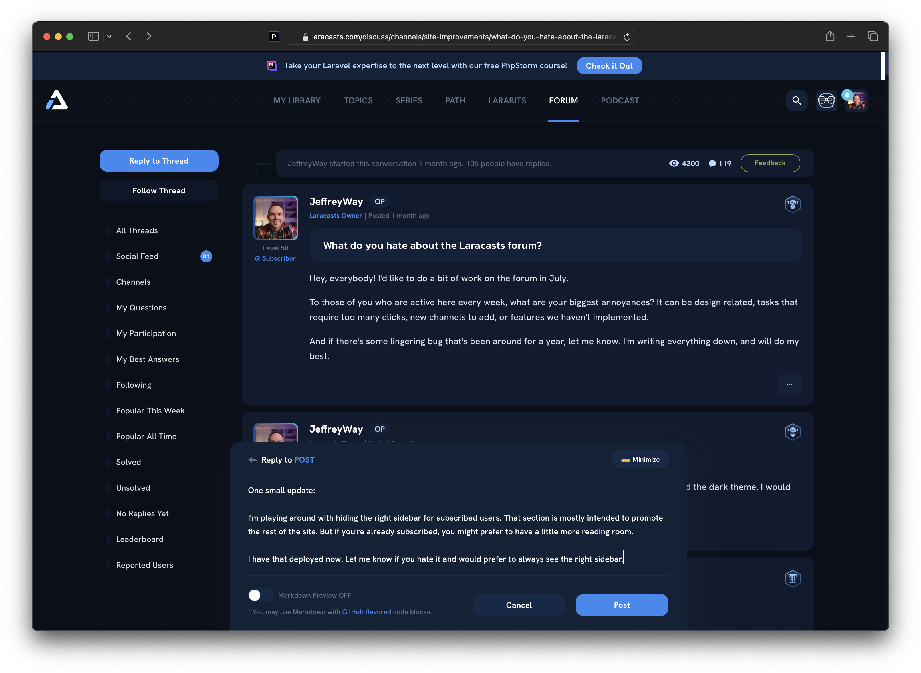
One small update:
I'm playing around with hiding the right sidebar for subscribed users. That section is mostly intended to promote the rest of the site. But if you're already subscribed, you might prefer to have a little more reading room.
https://laracasts.nyc3.digitaloceanspaces.com/tmp/two-column-layout-example.png
I have that deployed now. Let me know if you hate it and would prefer to always see the right sidebar.
@JeffreyWay I like it. However, it would be good to "Mark for reference" courses and lessons, and then display them to the right side, that way it would be super easy to copy paste the url in your replies, and maybe even add external links to posts.
This would be nice since I'm constantly (it seems) link to the beginner courses.
I noticed that there is a new 1000xp for the best answer, which means that the currently active users will catch up faster than in the past.
Is it planned that the experience will be recalculated?
@MichalOravec I'm working on some XP changes as we speak. We'll raise the max level beyond 50, introduce prizes (free shirt at level X), a special award at the highest level, etc.
Currently active users won't be affected. If you or @snapey receive a best reply, your XP will grow at the same rate as everyone else. But yeah, ancient accounts with high XP will fall behind a bit...which is fair, I think.
@JeffreyWay just seen this and saw I'd dropped down the Leaderboard. That'll teach me for not keeping up.

Please bring back the previous dark design. You changed the colors about a week ago and I honestly don't understand why. Laracasts was perfect before that
@brainjet I thought it was just me but yeah, the colour palette seems to have gone from a nice dark blue to a lifeless grey-blue.
@martinbean Yeah. Unfortunately due to readability in light conditions we had to choose something less dark. This is the middle ground between that deep dark blue and a light theme, since we still wanted to keep a dark theme. This is also the reason why there's no more light theme on the forum, since we bumped the brightness. I'm also a fan of darker themes but unless everyone has 2k nits on their monitor, not sure how to compromise this, haha.
@brainjet @jeffreyway No, please leave it alone.You made it where it's now not as loud to the eyes. The original dark theme hurt my eyes. And if you would recall another question on this i'm definitely not the only user with a dark theme hurts your eyes. He's a subscriber.
@martinbean That lifeless Gray blue as you call It is not as bad on some of our eyes.
@martinbeam I quite like the lifeless grey-blue.
The deep blue was nice, I agree, but failed in conditions where the lighting wasn't ideal. We received lots and lots of support requests about this. And I experienced it myself. I'd go to a coffee shop, sit by the window, and really struggle to read the site on my laptop. I don't feel that way with this new color.
@jlrdw Glad to hear it.

Quotes are not appearing as quotes, the contained box color isn't clear.
The 'solved' badge on a page of posts is barely perceptible now? Has it always been like this? As soon as you see what might be a new presentation its hard to remember what it was like before.
@Snapey I suggested a light grey-ish border around it to make it pop a little more.
@Snapey I'll tweak the text color a bit to make it stand out more.
@JeffreyWay it became harder to notice (for me anyway)
@jeffreyway Could we get additional languages supported by the Markdown code blocks?
Two that I commonly try to use, and would be massively helpful, would be ts (for Vue code that uses TypeScript) and diff (for better showing what lines of code may need to be removed and what they should be replaced with when answering questions).
@martinbean Sure. Adding a task now.
@martinbean Okay, done.
function test() {
- console.log("Hello, World!");
+ console.log("Hello, Laracasts!");
}
@JeffreyWay Amazing. Thanks!
@JeffreyWay how do we show diff lines?

@Snapey https://welearncode.com/create-diff-markdown/
function hello(){
- Delete this
+ keep this
}
@JeffreyWay Adding to this, what languages are currently supported?

@jeffreyway Hate is too strong of a word, there is nothing to hate here.
One thing that has mildly annoyed me is the inconsistency of the member badges being displayed on each reply. The badges it displays are seemingly random on each thread. On this thread, it might show the Laracasts Mastery Badge, on another, it might show Chatterbox and Lifer. This bug has persisted for years.
Hello @jeffreyway
I've been thinking about the leaderboard and how it is absolutely unattainable for someone new to Laravel to ever see themselves on there. After 10+ years there is just too much history to overcome. If nothing is done about this, there will be more and more pressure to declare XP bankruptcy and start again, or to value new behaviour more highly than old points. This has already started.
What I would like to suggest is that the existing leaderboard is still maintained but is not the immediate thing you see when bringing up leaderboard. Instead what you see is a leaderboard that only considers points obtained in the last 52 weeks (rolling, not annual)
This would create a more dynamic board where participants could see themselves rising over a much smaller time frame, and also people going down the leaderboard if they stop participating as their older point attainments drop off.
A tab could lead to the 'All Time Leaderboard' to respect the legacy scores (which are still being updated).
You might also make a course out of time series data or event sourcing! Like a company sales league that we often are asked to build.
Perhaps some new badges for 'rising star' etc, or a chart with risers / fallers and weeks on the chart stat similar to the music charts.
@Snapey I like the leaderboard idea. I think it's good to have a weekly scores. And weekly person of the forum (might be a badge for how many you get this :D).
Stackoverflow has something like that: https://stackoverflow.com/users

Have a Lary AI Chat page to access the chat's history in addition to or instead of a chat. I don't want to delete the previous chats so I have to scroll down every time I want to see the newest answer. I suppose you could display the newest answers at the top instead of the bottom. Having a Lary AI page would make it easier to find old questions/answers instead of having to infinite scroll the chat. Also, there have been errors loading the chat in the past, probably due to questions containing code, so I had to delete all my prior questions in order for it to work again. It would be nice to have a markdown toolbar.
Images aren't hosted here. I suggest don't allow outside image sites, rather do something similar to either:
Only allow image uploads here and have very good virus and malware scanning for such images.
More and more of these image hosting sites are becoming homes for malware. Not to mention embedded image malware.
Links only would be fine, that way a user can decide if they want to "chance" following such a link.
Edit:
Or at least detect an image and have a warning in the post title you add, not user. Like:
[Image] Title of post user typed.
Same if any replies includes an image, then change original title also to include [Image].
Are these pages with images being scanned for viruses and malware?
@JeffreyWay It seems there’s an issue mentioning users with “@” symbols in their username. Latest example: https://laracasts.com/discuss/channels/laravel/queue-running-order?page=1&replyId=945779
Could this be fixed? Or to disallow characters in usernames in the first place if they make them un-mentionable?
Please or to participate in this conversation.