burak's avatar

Redesign for Laracasts

Hi guys, i'm trying to improve myself on web design. I did a design for Laracasts :) Sorry for my bad English.

There is design;

Version 1

Regular Home Page https://dl.dropboxusercontent.com/s/d5qba5xacifrg9e/Laracasts%20Home%20Page%20Normal.png?dl=0

Hover States https://dl.dropboxusercontent.com/s/kci2utv23bdorb6/Laracasts%20Home%20Page%20Hover%20States.png?dl=0

Version 2

Click image for full size.

Home Page

Video Page

Have a nice day!

0 likes
26 replies
bashy's avatar

Do you want feedback on it?

  1. Colours are insanely bright, tone them down and pick ones that go together. Build a palette with http://kuler.adobe.com
  2. The typography is pretty basic/non-existent
  3. Size of the template is too narrow, use a wider more natural size.
5 likes
JeffreyWay's avatar

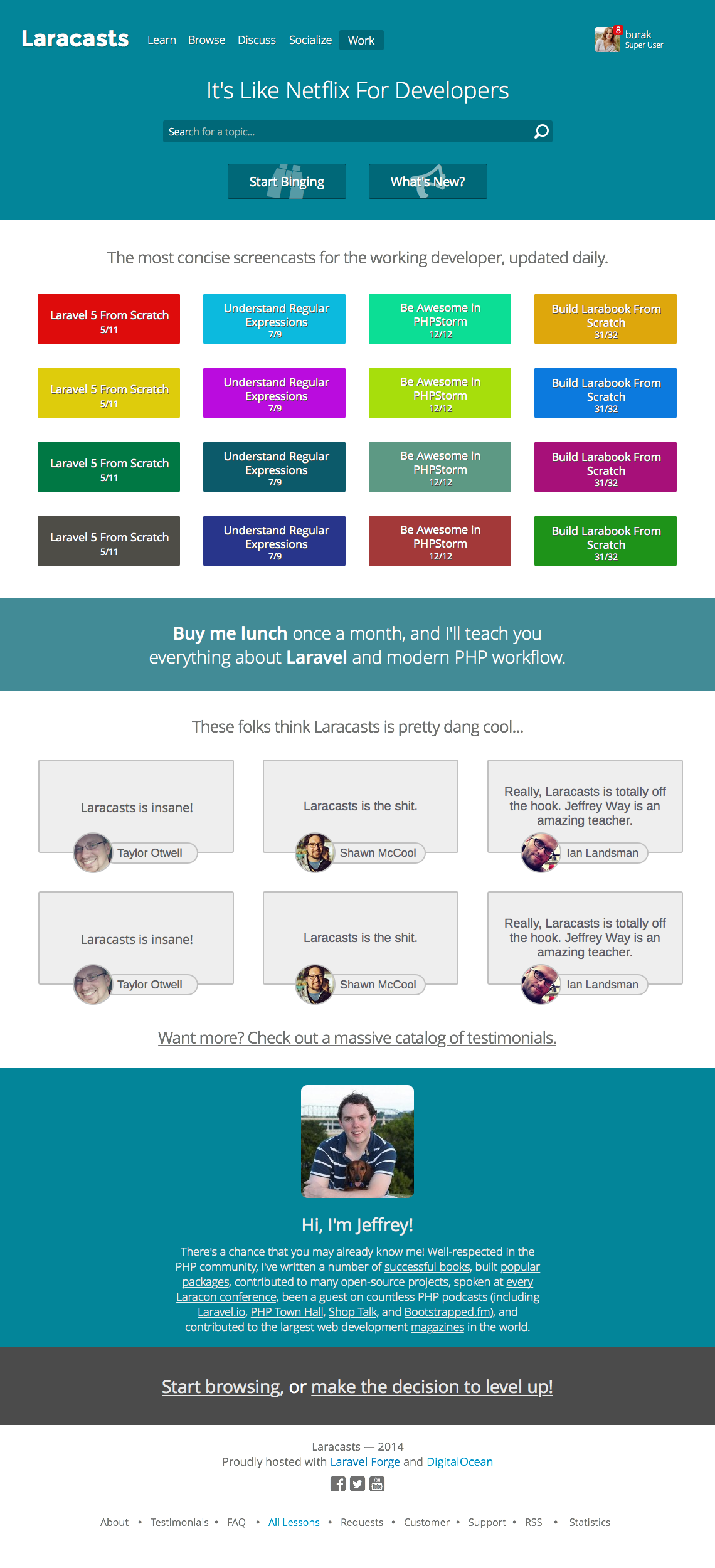
@burak It's a good start! I'm certainly no designer, so I'll refrain from offering much advice, but I agree with @bashy in that the color scheme needs work.

But, definitely, I'd love it if a bunch of you would give me a killer Laracasts design that I could use. I hate working on that part of Laracasts. I stink at it. :D

1 like
bashy's avatar

Jeffrey, I personally like the layout and design of Laracasts at the moment, it's different and unique :)

6 likes
theUnforgiven's avatar

I agree with both @bashy & @JeffreyWay colors are too bright find batch and tone them down,but layout wise I like and I would suggest pick a nice font like Open Sans.

1 like
alfonsan's avatar

I would like to add two more bullets:

  • Horizontal Rhythm. You are using a vertical grid. You lack an horizontal grid.
  • Proportion. When starting try to stick as much as posible to the 1.6 golden ratio before trying others.
1 like
burak's avatar

Thank you very very much for your suggestions, they're very useful for improving myself :)

1 like
RobinMalfait's avatar

The good part that you are not a designer is that you think outside of the box.

I know somebody with no programming skills at all, and created some awesome stuff just because they thought 'outside the box'

But yeah get a nice color palette :)

1 like
JeffreyWay's avatar

The bigger question is "What happens to Emma Watson once the 6 days are up?"

3 likes
5pArxz's avatar

I'm with @bashy i really enjoy the current look and feel of the Laracasts website, in short "it works".

3 likes
burak's avatar

Hello again guys! I was add Home page and Video page on first post.

I am waiting for new feedbacks :)

1 like
bashy's avatar

Much better from your first one, well done :)

1 like
stefanbauer's avatar

That screams for a "design-challenge" and the winner get a lifetime subscription :-D Then everyone is happy :)

JeffreyWay's avatar

I'd gladly give a lifetime membership to someone, but it's a little unfair.

bashy's avatar

To the fact that only some people can enter I think

xingfucoder's avatar

I think also is related with no all users could participate in equality conditions, some users are designers, others back-end, and some others are full stack.

JeffreyWay's avatar

It's crowd sourcing design work, when most people won't "win."

theUnforgiven's avatar

What about 1 year membership? I don't think it's unfair for a 'designer' to have a go at this and you Jeff pick a winner and use the new design.

stefanbauer's avatar

Well, for me, there is no necessary to "win" something. Maybe there could be a challenge without any prices. It should just be fun to see some other design ideas. Nothing special. Anyways, i like the current design, so don't get me wrong :)

Please or to participate in this conversation.